
O’Connell Architecture Letterpress Business Cards
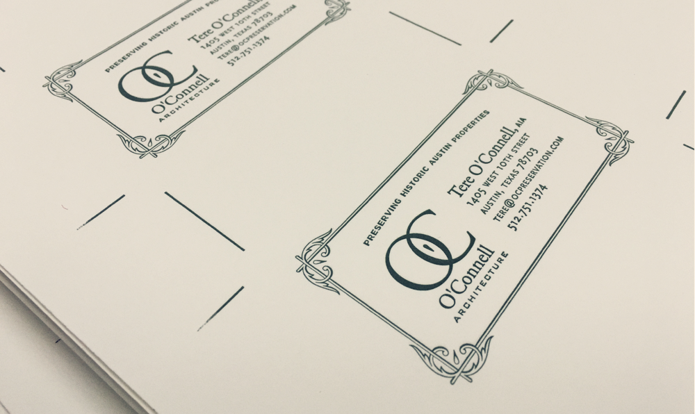
This job came to me from a favorite letterpress printer. Her client wanted new business cards that reflected the specific focus of her practice, preserving Austin’s historic properties.
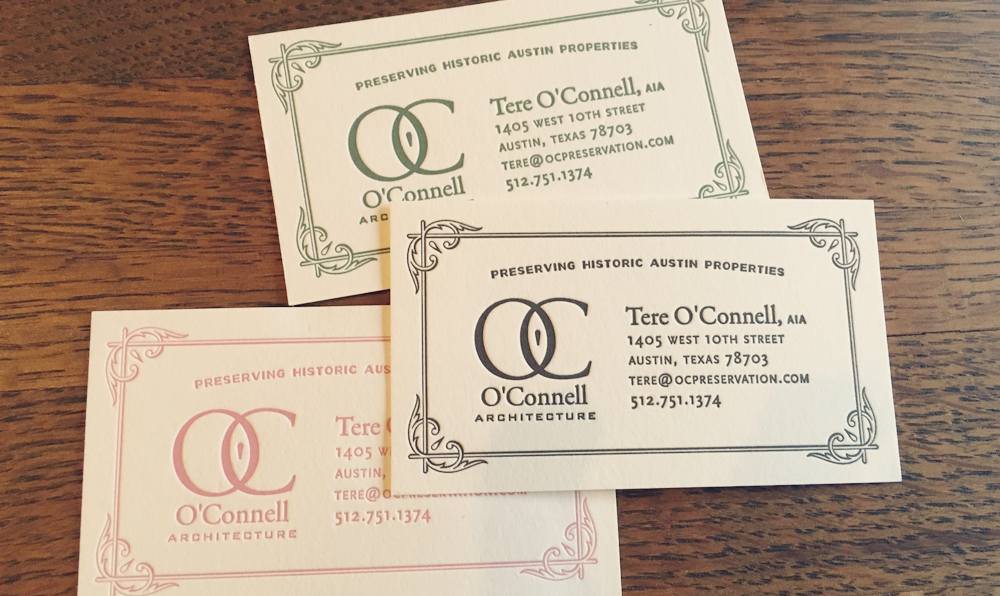
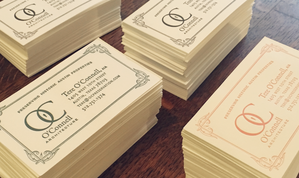
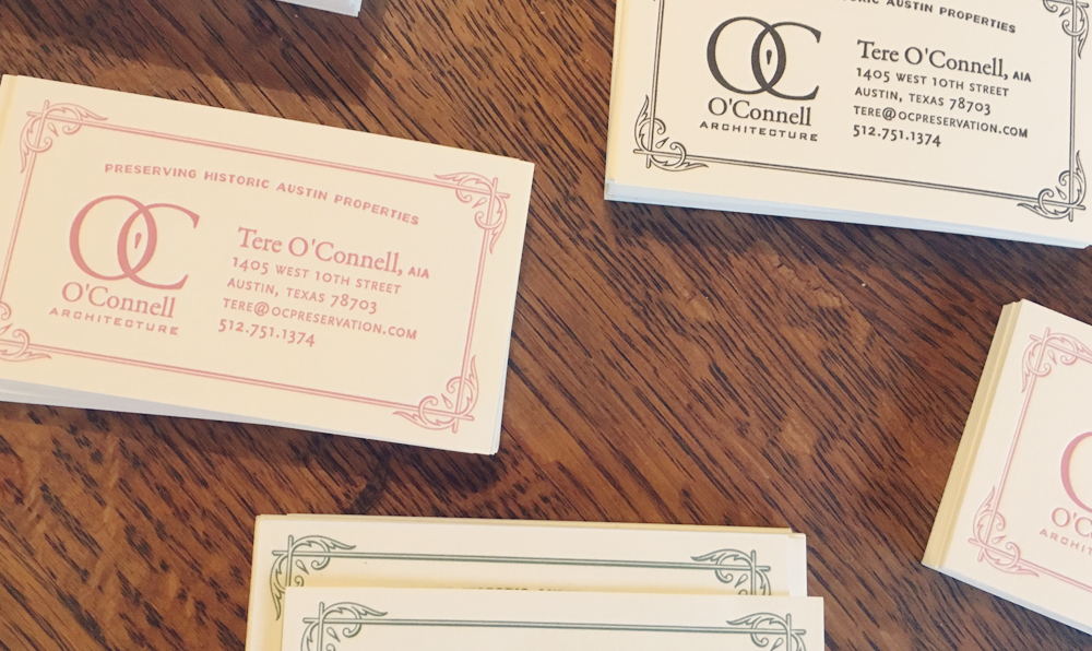
Before I met architect Tere O’Connell, I never really considered historic preservation in architecture. The discipline seeks to find beautiful and inventive ways to maintain and reuse existing buildings and landscapes. Learning more about this subject took me down rabbit hole into the world of Sanborn Maps and early 20th century typography. A lot of the discarded designs we much more elaborate. Tere honed in on the simplicity that reflected her own approach, and then chose three colors pulled from the art nouveau art she loves, making the cards even more personally tailored to her.
I tightened up her logo mark, and in the process of creating the cards, created a wealth of assets that she could keep and use as she grows her brand. This project was a real joy for me.

Back